
The main image shows a photo of the artist, Drake, looking at the audience, with a passive expression on his face, showing pride, power and dominance. He is presented on a dark background, the same as his shirt, which makes his shirt's slogan stand out as well as making our eyes drawn to his face, as it stands out too. This presents the artists importance.
An "exclusive" interview is advertised, but no freebies have been advertised which suggests the older target audience. This shows that they do not need freebies to promote their magazine to the target audience. This shows that they chose to promote their magazine to an older audience.
Words such as "exclusive" and "new" have been chosen to promote the magazine, this shows that they have decided to use persuasive language to promote the magazine. Using persuasive language promotes the magazine to the specific target audience, rather than use other techniques such as freebies, or use other artists images. VIBE tend to place one image on the magazine cover, rather than fill the page with other artists, for example Kerrang! This is their style of imagery and language.
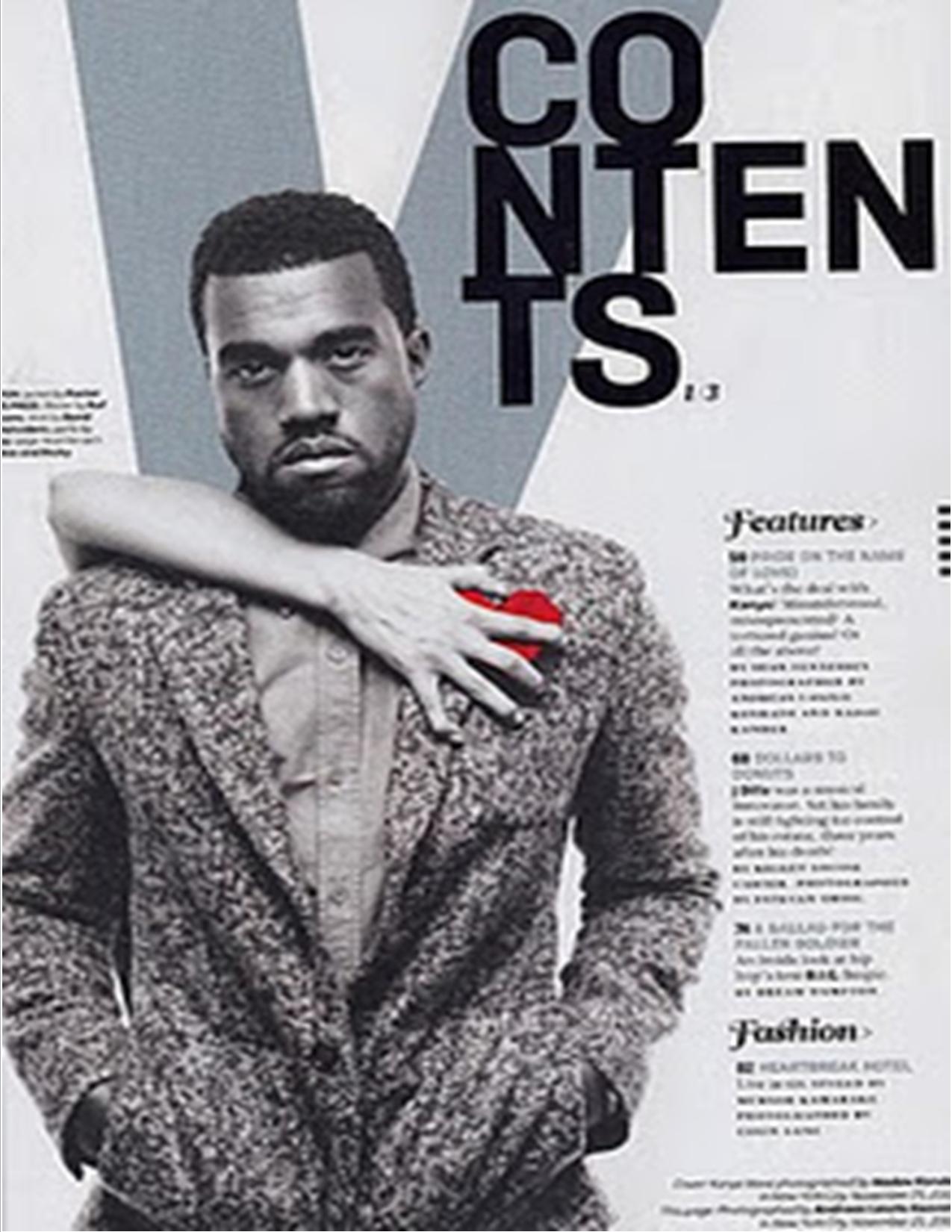

VIBE have a running theme through their contents pages, that they present their titles in upper-case, bold writing. In the current magazines they write "contents" in a unique way, this would be to make the page recognisable. Also in the background behind the image they post a letter "V" from the masthead, which stands for "VIBE", again to fit the style and design of the magazine.
The colours are often dark and fit with the image to give a calm and relaxed feel, as the target audience is older for VIBE readers. For example, the image on the left is in black and white, so the contents page is grey to fit with the theme. This ensures that he image doesn't stand out too much. The image on the right is the same, as the man has dark skin, and his accessories are dark, the background fits and doesn't contrast with him, this gives a relaxed feel, as the contents page is meant to be readable to entice the reader to look at specific pages. If the contents page was shocking, bright and stood out, it would draw the attention away from the contents list, and more to the image.
The theme for VIBE is simple and bold. For their contents pages, the theme is calm and discrete. This ensures that the reader can recognise the artist advertised on the contents page, but also still read the contents page as the image doesn't stand out as much.
The font varies in the magazine, from the bold title of "VIBE" in upper-case, from italics or 'fancy' writing on the contents page. This could be to add class or appeal to the older audience. The theme of bold capital letters also runs through the whole magazine, especially on titles and feature articles.
Like the front cover, VIBE tend to use one image for the contents page, this could be to keep the theme simple and neat, which is different to other magazines which may use more than one image to advertise lots of artists. The simple theme runs through VIBE's
Another way VIBE keep their contents page smart, is by keeping the font small, and not taking up much space. Most of the space is taken up by the image and the contents list is places within or next to the photo, this means that people have to look into the photo to read the contents page. Again this doesn't draw all of the attention to the image, but makes the contents list appear smart and neat.


Again, the colour scheme links well with the photo, for example the article about Eminem shows him, on a white background, wearing a white overall, with blood over it. He is holding a knife so we can guess where the blood is from, but because the main colours are white black and red, the way they have presented the title is in black and red writing. Black and red are both colours that link with danger and power, so having the title black and red links well with the photo. This ensures that the only colours our eyes can see are the ones that stand out, in this case, black red and white. This is a clever technique that VIBE often use to make their magazines look attractive.
In the second image on the right, there is a photo of Wiz Khalifa wearing a hat that is of a distinctive colour. The main colours that we see are dark. The colours on the image are all simple. These colours are grey, black, brown and orange. Although two shades of grey are used, these colours link and ensure only his orange hat stands out. On the other side of the double page spread we see the background, which is the colour of the smoke in the image. We see his initials (WK) which are presented in the colours of his hat, which is immediately distinctive. The rest of the writing is either orange, or black, and the drop-cap is orange which again links with the image. This article is just as smart as any other that are presented in VIBE as they use a limited range of colours, and use them well. The orange would stand out on a black background, but the white background on the text side balances it out so it doesn't look as sharp and bright.
Another style of VIBE is to quote or use a small statement. For example on Wiz Khalifa's article, they question "How high?" - This makes the audiences know that the article will include some information about how intoxicated he is, was or has been. This is an advertising technique. On Eminem's article it says "I almost died, and still went back to using" which makes us wonder what he was using. This is similar to the other article which left us on a cliff hanger. This is a style the VIBE often use to catch attention of the readers.

No comments:
Post a Comment